WeTalk
Prototypes
Context
WeSchool is a on online education platform. Its aim is to innovate learning by making it more inclusive, collaborative and engaging. Its users need to communicate with each other and easily share platform content.
Students use direct messaging apps to communicate with their classmates about the homework, group assignments and extra-curricular activities.
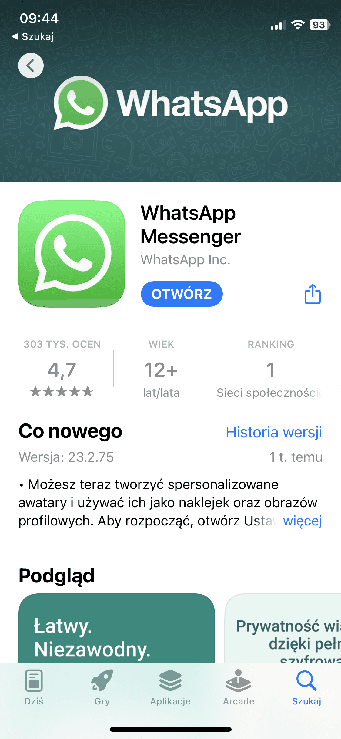
For this purpose they use the most popular communicators such as: WhatsApp, Messenger and Telegram - the same they use for the conversations with their friends about 'random' topics, which are a common cause of distraction.
Problem
There is no direct messaging application for educational purposes.
Solution
Students should have a place to grow together and to communicate with each other (help, share, inspire) about school, sports and their hobbies - in one place, without distractions.

Branding
Screen designs
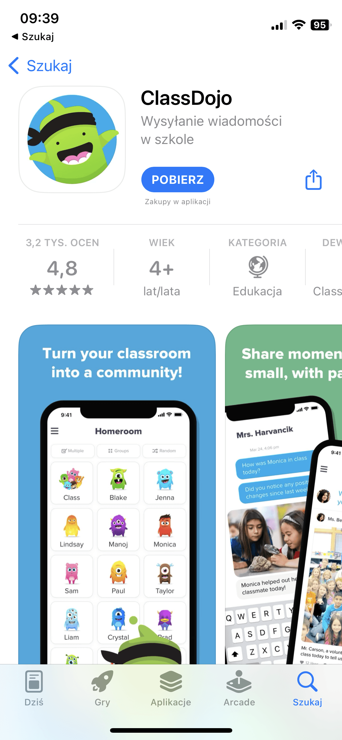
Competition analysys
Other direct messaging communicators available on the market focus on different purposes than education:
• Slack, Teams: work
• Tinder, Hinge: dating
• Discord: gaming


Competition analysys
UX Personas
To understand students' needs and everyday challanges I researched student communities by interviews and online surveys. As a result I created two personas who will be using the app with a slightly different area of focus but both sharing a goal of self-delevopment.
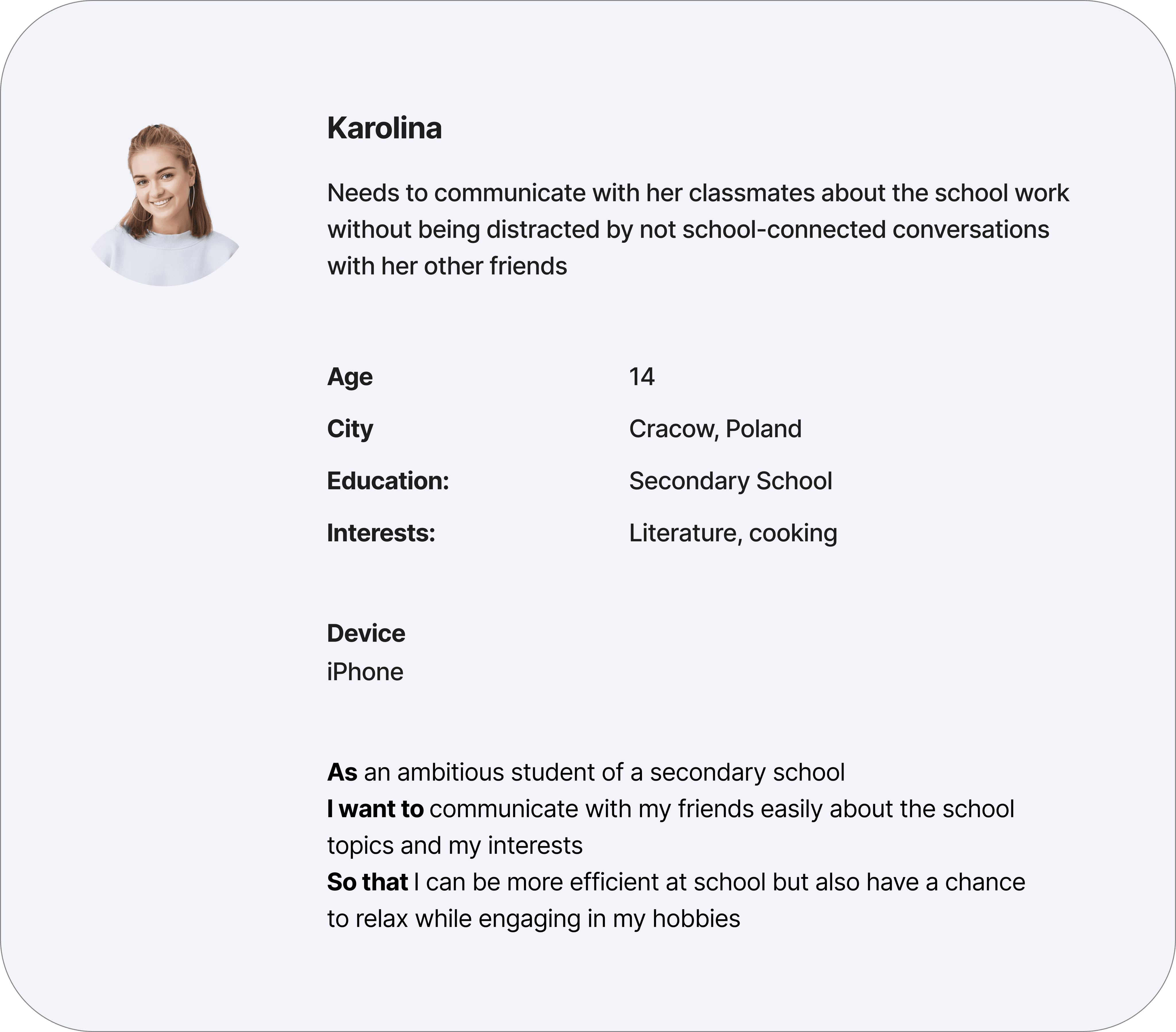
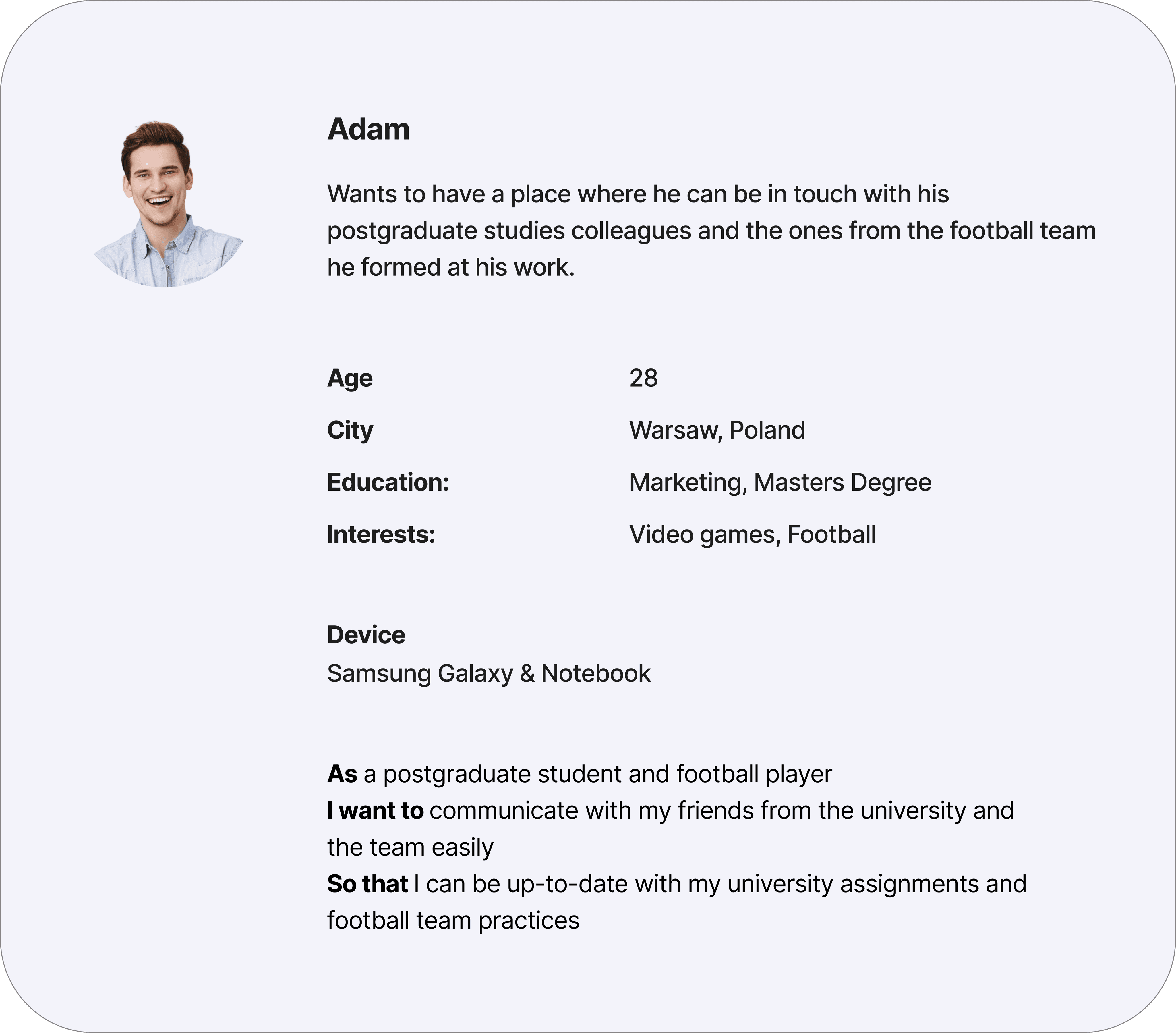
User personas
User flows
Mapping the user flow was essential for designing a smooth experience of launching and using the app. I used common UX patterns so that the users will instantly feel comfortable while navigating the app.

User flow
Prototyping
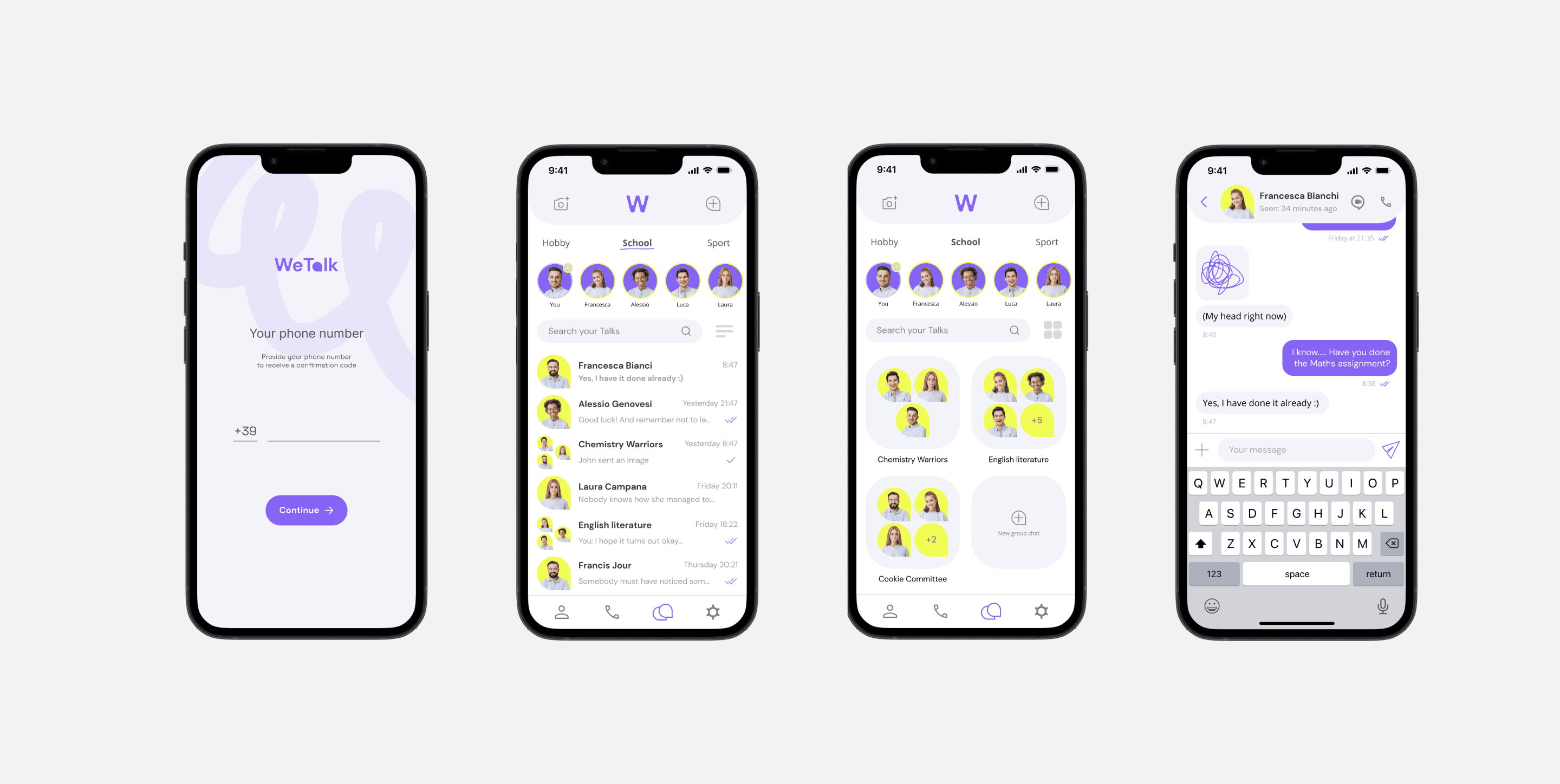
Based on the user flow diagram I identified screens that need to be designed. I wanted to keep them very clean and intuitive.
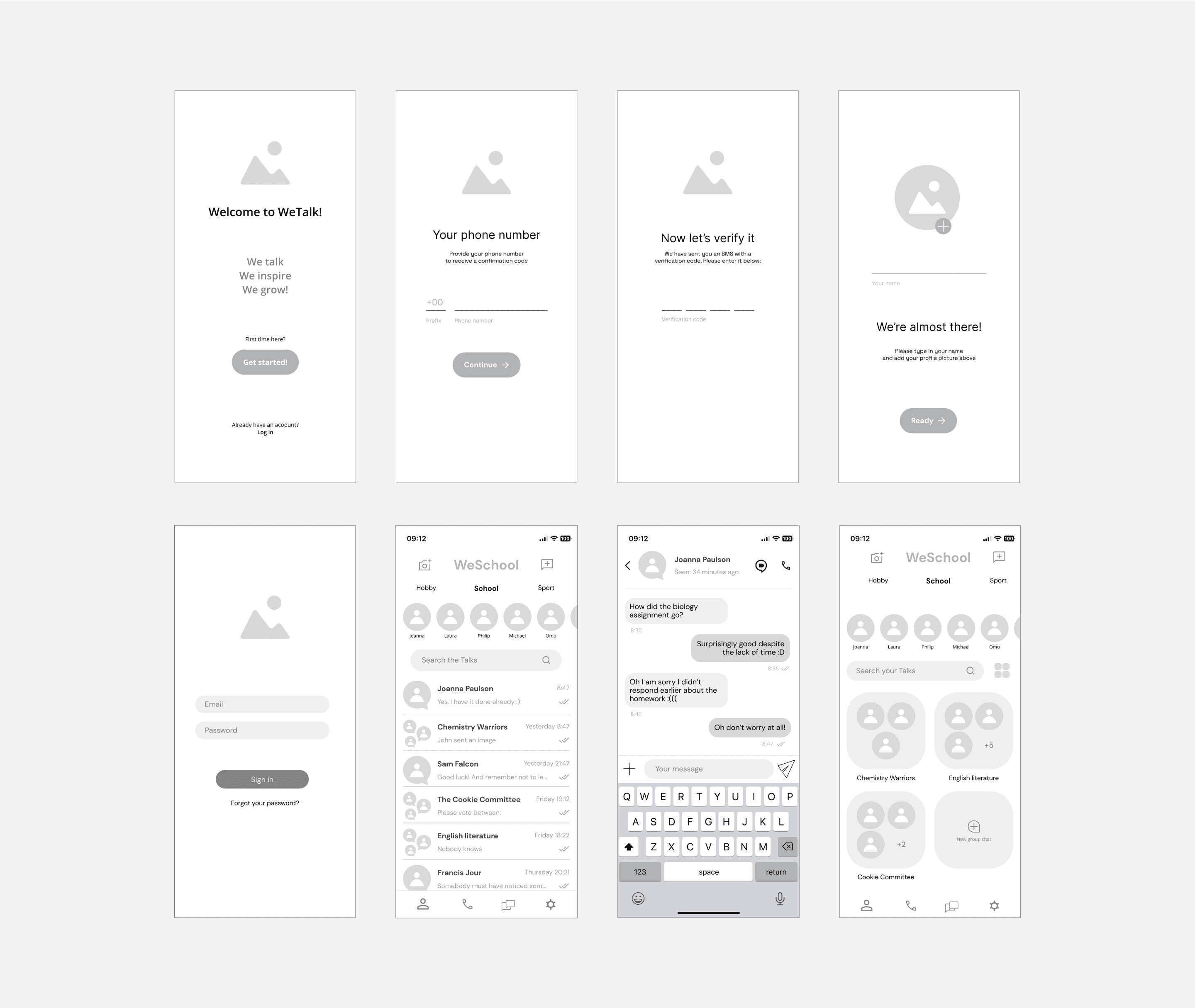
Wireframes
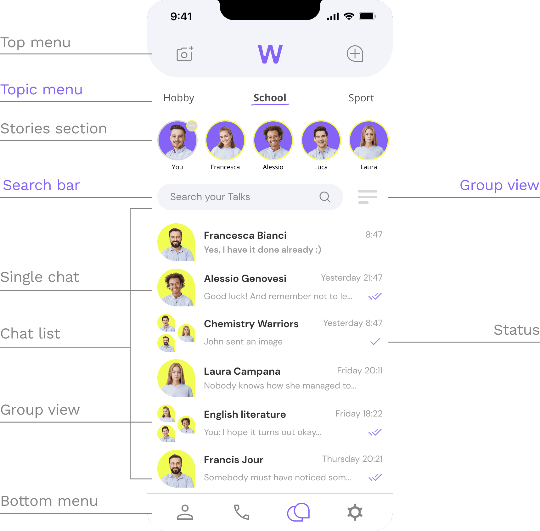
The design
The user interface design is clean and clear. It looks familiar to the most popular communicators at the moment to make the engagement with it intuitive for the new users.
The primary upper menu serves to create a new chat or a story. The secondary upper menu is for clicking through different chat subjects such as hobby, school and sport.
The bottom menu gives access to profile information, call list, chat list and app preferences.
Visual language
Visual language goes in line with the current WeSchool's CVI. What is new is the blurb shape that appears in the WeTalk logo in place of the 'a' letter. The blurb shape appears throughout the app's UI in iconography as well as serving a background for the profile pictures.
Although I used WeSchool's branding colours I decided for a more significant presence of white colour on the app main screens together with light purple. It makes the elements like user thumbnails and messages content pop out more as they are the most important components of the app.
The profile pictures have a unified background colours (purple for stories and yellow for messages) as the app uses intelligent image background remover from any uploaded portrait and replaces it with the colour to make the app interface less distracting. (With the assumption that other communicators such as Instagram serve the teenagers' need for self-expression)